

Overview
Prosemirror - powerful instrument to build rich-text editor with high ability to extend and full control to document contents, rendering and user interaction. We can easily implement mentions, tables, integrate with entities from other parts of application and extend functionality by many ways. In terms of prosemirror entity that represent specific content called a Node.
In this article I’m going to show how to declare custom prosemirror node, how to render it with toDom method and how improve that with custom NodeView using React component.
Custom “callout” node
Good example we have is callout node - text block that can be highlighted with color, icon and indention to emphasize or warn about something in main narration:
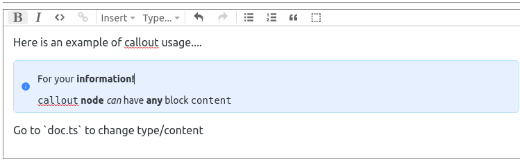
In scope of this article we will only talk about rendering this node, but initial idea is to allow user to set callout type, and insert/delete callouts. We will focus on that interactions in next articles about plugin system and transactions.
What is interesting here and most probably you already get that from image: we basically just wrap area of editor content with our new node, allowing user to have all editing features in place. And here we going to see how to achieve that using react component.
Editor structure
We will declare our node in a directory called callout to encapsulate custom logic and rendering process from editor setup. React components, types etc will also go there.
So, our editor structure will look like this:
|src
|-- editor
|   |-- callout
|   |   |-- components
|   |   |   |-- Callout
|   |   |   |   |-- Callout.tsx
|   |   |   |-- CalloutIcon
|   |   |   |   |-- CalloutIcon.tsx
|   |   |-- constants.ts
|   |   |-- nodes.ts
|   |   |-- nodeviews.ts
|   |   `--types.ts
|   |-- doc.ts
|   |-- editor.tsx
|   |-- editor.css
|   `-- index.ts
|-- App.tsx
|-- index.tsx
`-- styles.css
We will focus more on contents of editor/callout in a next few sections.
Callout Types
User can choose callout type from info, warning and success types:
types.ts
export enum CalloutType {
  info = "info",
  success = "success",
  warning = "warning"
}

export interface CalloutNodeAttrs {
  type: CalloutType;
}
Callout Node
nodes.ts
import { NodeSpec } from "prosemirror-model";

import { CalloutType } from "./types";

export const calloutNodes: Record<string, NodeSpec> = {
  callout: {
    group: "block",
    content: "block+",
    defining: true,
    selectable: false,
    isolating: true,
    attrs: {
      type: { default: CalloutType.info }
    },
    toDOM: (node) => {
      return [
        "div",
        { class: `callout ${node.attrs.type}` },
        ["div", { class: "content" }, 0]
      ];
    }
  }
};
So key callout here is the same key that will be used to determine node spec in editor schema. Now we’ll look at the node definition:
group - group or space-separated groups to which this node belongs. can be referred from content expression.
content - declares what we can expect in node content. has a special expression syntax
defining - makes node persist in replace (paste) operation
selectable - is node can be selected with cursor
isolating - set node boundaries for editing operations
attrs - custom node attributes, only used to set type attribute, which set by default to info
toDOM - we will talk about it in details in a next section.
Render node with toDOM method
Easiest way to implement node render is to declare toDOM node method, that we saw for paragraph node above. It clear, intuitive and you basically don’t have to worry about anything else with that approach. Yet it has its disadvantages: it’s not very comfortable to describe really complex html and there is no good way to make it interactive. You probably want to start with this when you describe custom nodes, and turn to nodeviews only when you have to.
We are going to do both in turn. Look again on this code piece:
toDOM: (node) => {
return [
"div",
{ class: `callout ${node.attrs.type}` },
["div", { class: "content" }, 0]
];
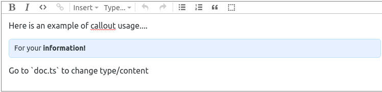
}Callout node allows user to enter any block+ content as we declared in corresponding node attribute. It means that we let prosemirror deal with user input by itself. And we see here that we have 0 - “content hole” inside nested div. With that in place, callout will look like this:
Okay, but what if we need to have more control over html? We also want to display icon and properly handle callout type with corresponding icon and color. Obviously it can be achieved here in toDOM method by creating more nested elements and maybe little bit of business logic.. But we’d like to distinguish things like that, right?
For such cases there is a NodeView.
Render node with NodeView
For some use cases, such as embedded node-specific editing interfaces, you want more control over the behavior of a node's in-editor representation, and need to define a custom node view.
nodeviews.tsx
import ReactDOM from "react-dom";
import { Node as ProseMirrorNode } from "prosemirror-model";
import { EditorView, NodeView } from "prosemirror-view";

import { Callout } from "./components/Callout/Callout";
import { CalloutNodeAttrs } from "./types";

export class CalloutNodeView implements NodeView {
  public dom: HTMLElement;
  public contentDOM: HTMLElement;

  constructor(public node: ProseMirrorNode, public view: EditorView) {
    this.dom = document.createElement("div");
    this.contentDOM = document.createElement("div");
    this.render();
  }

  update(node: ProseMirrorNode): boolean {
    if (this.node.type !== node.type) {
      return false;
    }

    this.node = node;
    this.render();
    return true;
  }

  destroy(): void {
    ReactDOM.unmountComponentAtNode(this.dom);
  }

  render = (): void => {
    const attrs = this.node.attrs as CalloutNodeAttrs;
    ReactDOM.render(
      <Callout contentDOMRef={this.handleRef} type={attrs.type} />,
      this.dom
    );
  };

  handleRef = (node: HTMLElement | null): void => {
    if (node && this.contentDOM && !node.contains(this.contentDOM)) {
      node.appendChild(this.contentDOM);
    }
  };
}
We declare dom and contentDom properties as a container and content elements respectively. Then in constructor we create div elements for both and call render method.
update and destroy are default methods and have to be implemented as prosemirror uses them internally. It’s quite simple: we check for node type in update and call render for matching node. And unmount component on destroy
Most interesting part here is render method. We bootstrap a react component to dom element and use handleRef to add content to a DOM node. We’re talking about ref in a more details a bit later. Now let’s check the React component.
React component
Callout.tsx
import cx from "classnames";
import React, { Ref } from "react";

import { CalloutIcon } from "../CalloutIcon/CalloutIcon";
import { CalloutType } from "../../types";
import { calloutColors } from "../../constants";

export interface CalloutProps {
  type: CalloutType;
  contentDOMRef?: Ref<HTMLDivElement>;
}

export const Callout: React.FC<CalloutProps> = ({ type, contentDOMRef }) => {
  const className = cx("callout", type);

  return (
    <div className={className} data-callout={type}>
      <span className="icon">
        <CalloutIcon color={calloutColors[type]} type={type} />
      </span>

      <div ref={contentDOMRef} className="content" />
    </div>
  );
};
As we work with regular react code here we can use component to render icon depending on type:
import React from "react";
import { MdInfo, MdCheckCircle, MdWarningAmber } from "react-icons/md";

import { CalloutType } from "../../types";

export interface CalloutIconProps {
  type: CalloutType;
  color: string;
}

export const CalloutIcon: React.FC<CalloutIconProps> = ({ type, color }) => {
  const iconTypeMap = {
    [CalloutType.info]: <MdInfo color={color} />,
    [CalloutType.success]: <MdCheckCircle color={color} />,
    [CalloutType.warning]: <MdWarningAmber color={color} />
  }
  return <>{iconTypeMap[type]}</>;
};
But most important and not obvious here is contentDOMRef. We implement a callback ref that fills DOM node with it’s html representation we have from nodeview’s contentDOM attribute. It’s a quite tricky moment that we get content from editor and render it with react. And when user change callout contents, we trigger handleRef that adds that content to dom node . So roughly speaking it work like this:
CalloutNodeView.render -> Callout.render -> CalloutNodeView.handleRef
Editor setup
To sum up let’s review steps required to render custom prosemirror node with React:
Setup custom Node and add it to schema
Implement NodeView and bind to custom node on EditorState level
Render react component using NodeView.render method
Here we initialize editor with callout node and nodeview in another react component:
editor.tsx
import React, { useEffect, useRef } from "react";
import OrderedMap from "orderedmap";

import { Node, NodeSpec } from "prosemirror-model";
import { EditorState } from "prosemirror-state";
import { EditorView } from "prosemirror-view";
import { Schema } from "prosemirror-model";
import { schema as baseSchema } from "prosemirror-schema-basic";
import { addListNodes } from "prosemirror-schema-list";
import { exampleSetup } from "prosemirror-example-setup";

import { NodeViewsSpec } from "./core/types";
import { calloutNodes } from "./callout/nodes";
import { CalloutNodeView } from "./callout/nodeviews";

import "./editor.css";

interface EditorProps {
  value: object;
}

export const Editor: React.FC<EditorProps> = ({ value }: EditorProps) => {
  const ref = useRef<HTMLDivElement>(null);
  const editorRef = useRef<EditorView>(null!);
  const baseNodes: OrderedMap<NodeSpec> | NodeSpec = addListNodes(
    baseSchema.spec.nodes,
    "paragraph block*",
    "block"
  );
  const nodes = baseNodes.append(calloutNodes);
  const marks = baseSchema.spec.marks;
  const schema = new Schema({ nodes, marks });
  const doc = Node.fromJSON(schema, value);
  const plugins = exampleSetup({ schema });
  const state = EditorState.create({ doc, plugins });

  useEffect(() => {
    const nodeViews: NodeViewsSpec = {
      callout: (node: Node, view: EditorView) => new CalloutNodeView(node, view)
    };
    if (ref.current !== null && !editorRef.current) {
      editorRef.current = new EditorView(ref.current, { state, nodeViews });
    }
  }, [state]);

  return <div ref={ref} className="editor-sandbox" />;
};
Conclusion
Prosemirror is a beautiful tool that allow you to control things on any level. It has its learning curve, but in the end you can build really flexible and logically clear editors with it.
Yet it may look difficult to understand form the first sight, the main concepts is simple:
model (schema) - state - view
And this is something similar to what we all know from different MVP-like libraries and tools. With schema we describe entities (nodes), state uses schema and describe data structure, and view is responsible for how it look on page.
By the way, here is live demo so you can play with and check the full code.
In next articles we will talk about plugin system and how it can be used to make nodes interactive with react. We will implement menu to change callout type and make it interact with prosemirror transactions and update state.
Stay tuned.
Subscribe for the news and updates
Once we received an interesting task from a client. They needed to allow their users to upload a 3D model of the building and show it in a timelapse video from the construction site.

In this article we'll review general approach to working with the best kind of projects - the ones with old untested and undocumented spaghetti code and a tight schedule. We'll review anger management techniques, coping mechanisms and some refactoring tips that might come in handy.

Programmatic generation of PDF files is a frequent task when developing applications that can export reports, bills, or questionnaires. In this article, we will consider three common tools for creating PDFs, including their installation and converting principles.
In this RxJS tutorial article, we will focus on restoring the websocket connection when using RxJS library.

In this article, we will describe some useful scripts and directives we use with angular form validation in our projects.
Learn how to use "OR" and "AND" queries efficiently in Django without using database models Q. Enhance your query-building skills. Dive in now.