Rules and Tips for Good UI Design in Web Application
How do you choose a new smartphone? Is it the simplicity of use, design, or technical characteristics that most influence your choice? Most probably it’s all three and it’s safe to say that same applies to the choice of web apps. So, when designing a web application, there are two key aspects to keep in mind — user interface (UI) and user experience (UX).
WHAT IS WEB APPLICATION DESIGN
UI design in web application aggregates all functions and defines the way you will be interacting with the software or, in other words, the UX. The user’s experience is the overall experience you have when interacting with a system. Web application user interface is the very first thing you see when opening any application. Therefore, the first impression and the subsequent user experiences are critical here. To develop a beautiful and user-friendly web app interface design you might need to consult online with a technical partner and outsource web development.
BENEFITS OF GOOD UX AND UI DESIGN FOR WEB APP
User interface and user experience design are the defining ones when it comes to the profitability of your app. With the number of current products on the market, yours has to meet and exceed expectations in order to surpass them.
The benefits of good web-based UI and UX are listed below.
Boost customer satisfaction
If you offer a smartphone with an inconvenient web app design, users will most likely choose another app with more simple UI. The clearer interface and the better UX — the more satisfied customers.
No learning curve to struggle with
Some web application UI designs require some getting used to. It creates a direct connection with a so-called “learning curve” — the term that graphically represents the common saying “Practice makes perfect”. With the modern fast pace of life, few people are ready to practice in order to master just another app. So, the simpler the user interface, the fewer problems customers will face and, therefore, the higher the possibility that they will choose exactly your product.
Increased user adoption
User adoption is all about switching from an old system or product to a new, more efficient one. It is also about using it to fill some need. Customers who have been using similar apps may well switch to a new one designed by you, but only if it’s easier to use and more efficient.
Natural growth
Organic growth will be achieved if your customers start using the app after it had been recommended to them. This natural way, in contrast to artificially created adverts or paid links, is cheaper and more effective. However, it works positively only if your users have a satisfying UX.
Increased profits
A clear and easy-to-use UI for web applications is a benefit for both you and your customers. They have an application that works perfectly, meets their needs, and ensures a great experience. Hence your customer base grows thanks to word of the mouth which gives more opportunities to profit from the results of your work.
THE RULES OF GOOD USER INTERFACE IN WEB APPLICATION DESIGN PROJECTS
If you are developing an app from scratch, you will definitely need some useful tips. Let’s discuss the role of UI design in web app and some principles that professional developers follow.
1. MAKE EVERYTHING A USER MAY NEED EASILY ACCESSIBLE
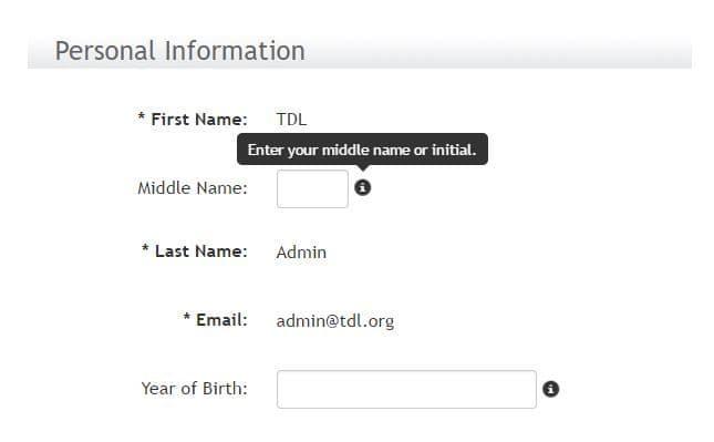
It doesn’t matter what kind of app you are designing — if users can’t find what they want in a matter of minutes, they’ll leave. This is why making things easily accessible is a fundamental rule. Use the shortcuts, hover tooltips, and tabs to make your web-based user interface clear and simple.
2. GIVE A FEW OPTIONS FOR CONTACTING YOU
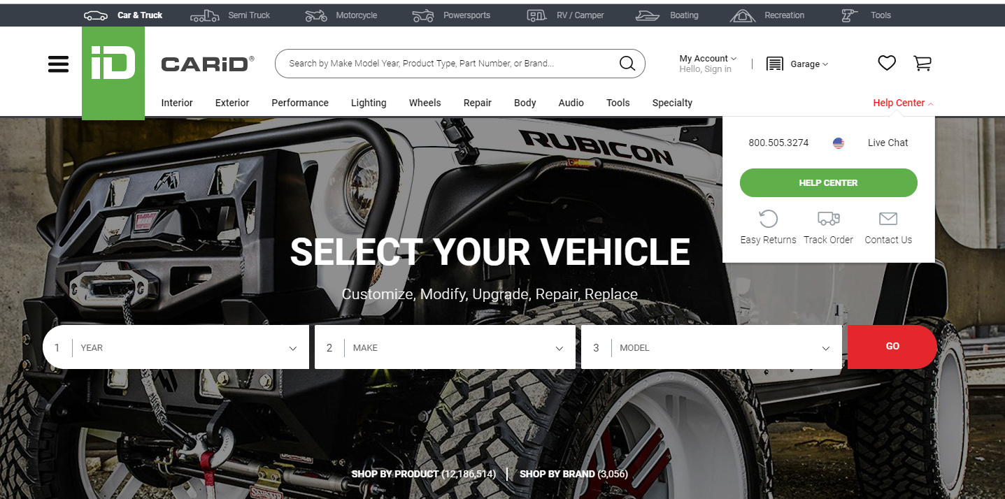
Such toolbar options as Help, Support, and Contact should be easily accessible as well. At some point, your customers will need to get in touch with you and it should be as simple as possible.
3. BE CONSISTENT
Your product has to work, look, and feel like one single unit. Therefore, being consistent is another crucial rule to follow when creating user interface for web application. The consistency of your interface is where the consistency of the entire app begins.
Consistency refers to everything from the font, colors, and design that users see on every page to the menu on the front page which has to be perfectly structured. It would be a great idea to make the web app interface feel more intuitive so the users are able to navigate easily.
4. APPROACH THE DESIGN WITH UTMOST CLARITY
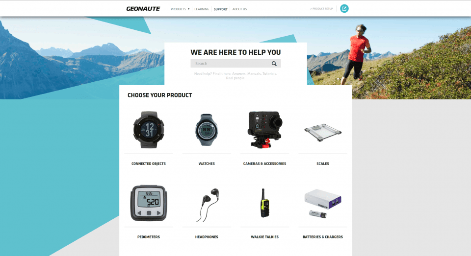
People who use your app don’t have to wreck their brains to understand what to do, where to click, and what to choose. It should be clear from the very beginning. One of the ways to make things obvious is to create a new page for every new step of the process. Here is one of a good example of user interface design in web app:
5. PROVIDE USERS WITH FEEDBACK
Make sure that your users receive small feedback on whatever actions they are taking. Once they click on something it would be useful of the system let them know how much time is left to upload the next page or download the file. Keep in mind that most people are impatient, but it’s less frustrating for them to see that the system is processing something.
6. USE RECOGNITION INSTEAD OF RECALL
No one wants to guess what icon they should click. Hence, all icons should be as recognizable as possible, so their usage becomes intuitive. Recognizing instead of recalling makes UX much more satisfying.
7. CHOOSE STABLE WAYS OF INTERACTION
This point connects to consistency because the ways a user will be interacting with the app have to be logical. Every page has to have the same way of interaction and include only functional images. This way users will avoid the confusion and frustration, and you — loss of customers.
8. GIVE USERS A CLEAR UNDERSTANDING OF WHAT TO DO
When Siri was designed, voice input was chosen as the main way of using the app and it never changed. Users just need to talk to the app, can’t get much clearer than that. Make instructions understandable to the users.
9. HEED THE DESIGN STANDARDS
There are certain graphics and icons that stay unaltered such as a question mark (?) indicating Help and hamburger icon ( ☰ ) representing the menu bar or a magnifier for the search bar. By following these UI standards for web application, you will avoid users’ getting disoriented.
10. MIND THE ELEMENTAL HIERARCHY
If you want to simplify the use of your app, follow the elemental hierarchy. Traditionally, things go from top to bottom and from left to right. In terms of app UI design, it means that the most important objects must be placed at the top of the page. This makes the UI clearer and process of using more natural and intuitive.
11. KEEP IT SIMPLE
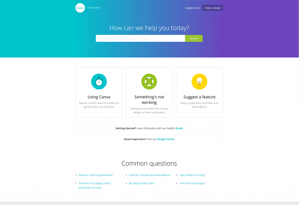
The easier it is to navigate through the app, the more confident and happy your users feel. So, make sure they don’t need to think twice on ant step. Here is a mockup of the first page which may serve as a source of inspiration for you.
12. MAKE EVERYTHING FOR THE USER FRICTIONLESS, AS MUCH AS POSSIBLE
Simplicity can be one of the basic user interface design principles for web applications. Users shouldn’t have any problems proceeding from one point to another. Think of the navigation, for instance. A convenient one would have fewer elements and familiar titles.
13. EMPOWER YOUR USERS
Whichever UI designs for web applications you are considering, they should not restrict or take control away from the users. Empower them with your UI instead. The very first thing you can do is locate the most important tools and buttons next to the users’ working area. Let them feel that they can do or undo any action at any time.
14. DESIGN WITH THE USERS IN MIND
Sometimes you need to give them the freedom to use app comfortably. One of the ways to do this is to add buttons Cancel and Undo to certain pages where they may need to make changes.
We hope now it is more clear for you how to design UI for web application.
There are some technical partners that you can find online in case you need professional help or advice. For example, Gearheart has an experienced and skilled team that can guarantee your security.
10 UI DESIGN CONSIDERATIONS FOR WEB APPS
You may use Photoshop or Pixelmator, hire the most creative illustrators, yet there are some points you should always take into account and monitor how they are done in your project.
BLANK STATE
The state of your app before the user makes any action is critical, as it gives a general understanding of what the application is about. There are some templates you may find helpful.
Here you can use media to demonstrate how things work.

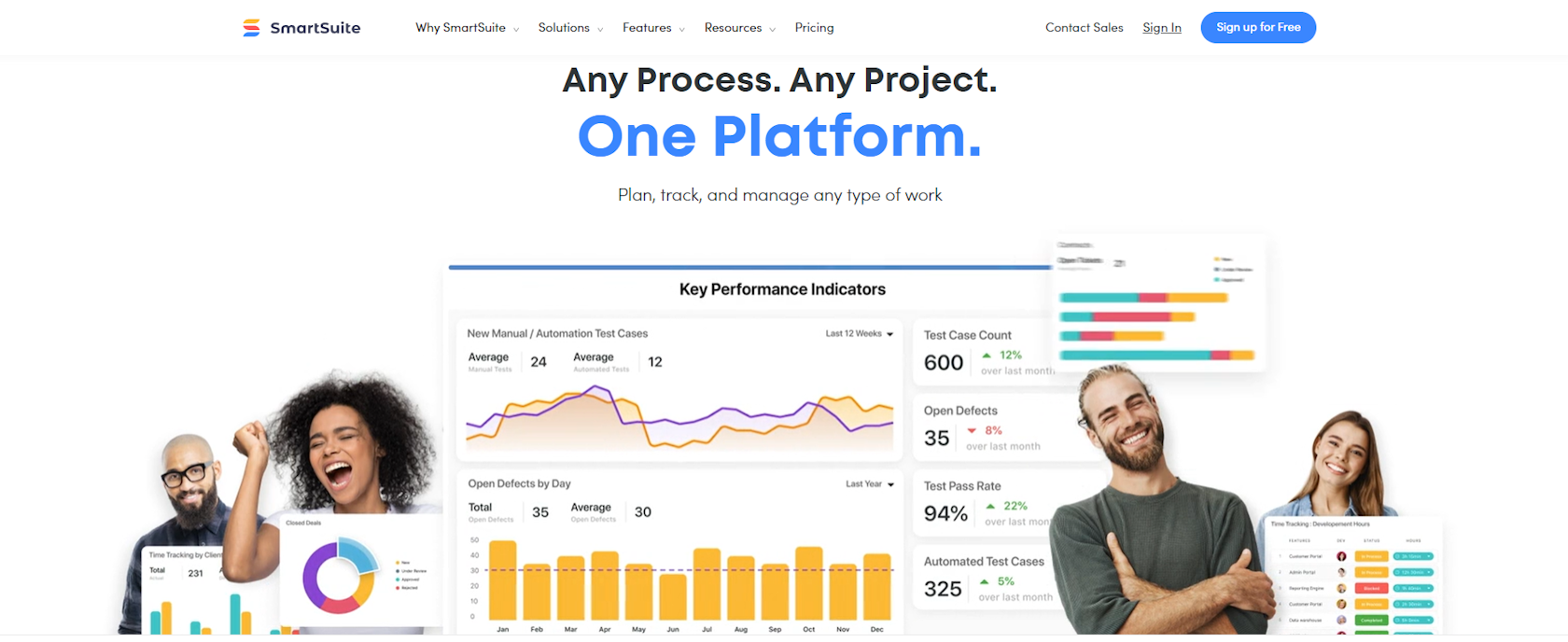
Start with a video tutorial like SmartSuite.
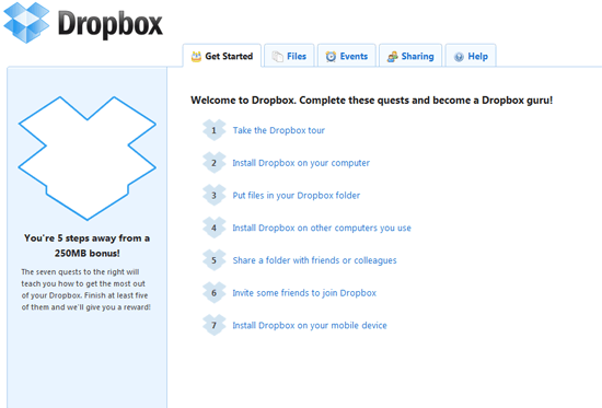
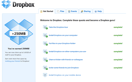
DropBox, on the other hand, suggests ticking off the steps:
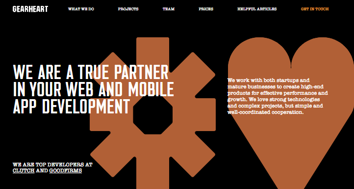
While Gearheart provides general information about the company and its projects:
DISPLAYING THE USAGE AND QUOTA INFORMATION
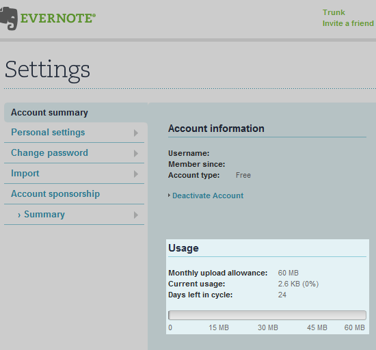
Those apps that have limited storage should inform their users about it in advance. They should have an opportunity to consider an upgrade before they run out of storage space.
This is how Gmail deals with it, by showing the information about the storage space left as a simple text:

You have to open Settings to see the calculation of quota/usage in Evernote:
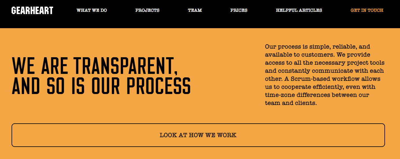
And Gearheart gives a clear idea of what the software development process is like:

DISPLAYING PRICING, UP- OR DOWNGRADE PLAN INFORMATION
This must be done simply and seamlessly within an application itself.
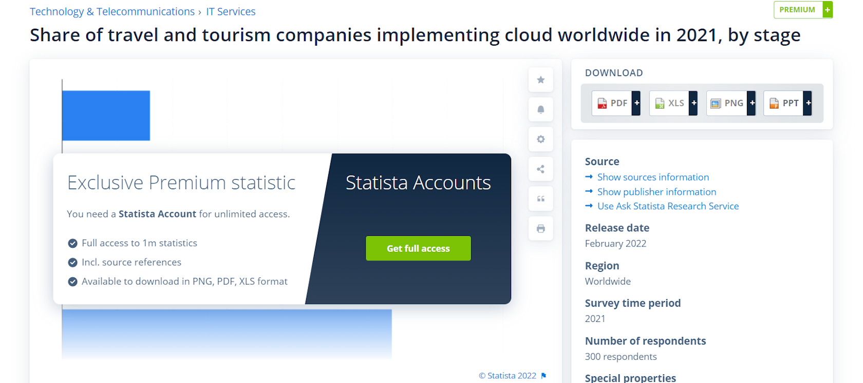
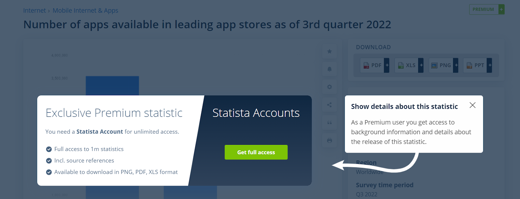
Statista has placed an update reminder right in the content you're interested in:
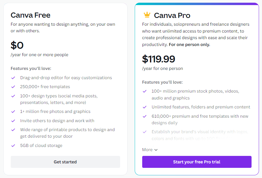
Canva informs you of what you can get by upgrading the plan:
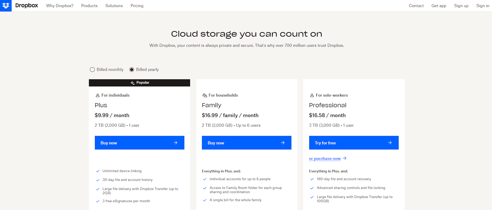
DropBox offers a great overview of its upgrade policy:
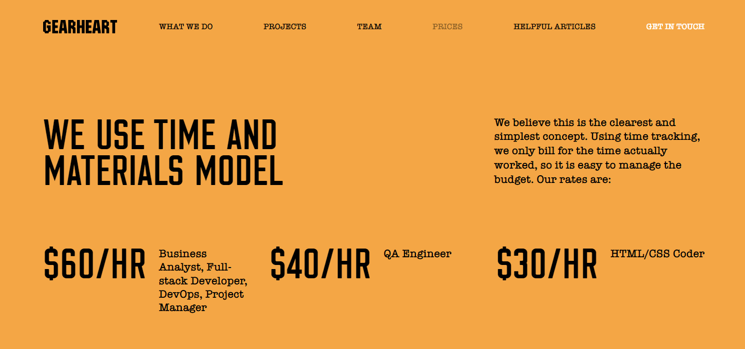
Gearheart provides a pricing and payment schedule:
EASIER NAVIGATION WITH UI ELEMENTS
The look of UI elements adds vitality to your app and helps users navigate.
This is how it looks like on Statista, with indications of what you can and can’t use:
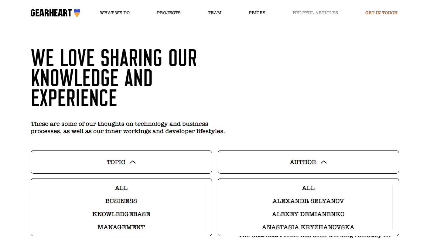
Gearheart gives some ideas on how to simplify navigation:
Making the UI Intuitive and Simple
Keep your UI as understandable as possible. Hide the buttons and icons which users don't need and use the approach of progressive disclosure.
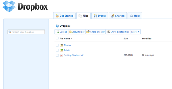
This is how it looks like in Dropbox. The inactive state:

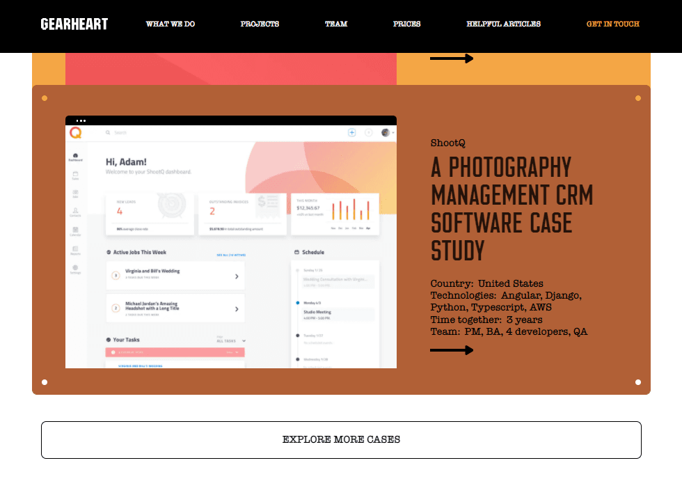
Gearheart shows more details after you click on a button:
THE RIGHT USE OF VISUALS
Icons, images, charts, graphs, and other visuals are great for making the web app user interface design more friendly. They make data more readable and simple.
Canva offers a list of the most popular designs through clickable images:

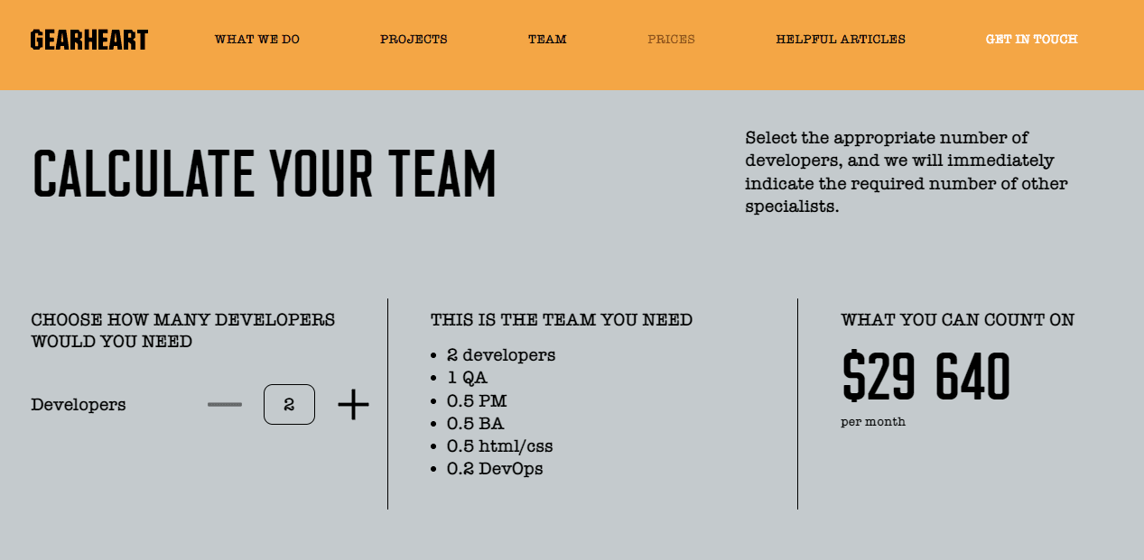
Gearheart uses calculator to demonstrate how the price of a project changes depending on the size of the team:
Easy-to-find Instructions and Information
Call boxes and notification areas are quite helpful, but it is important to locate them at the places where they will be convenient for the user and won’t interfere with the workflow.
Choosing the Proper Speed for the User Interface
Fast means efficient and this is what every user looks for in an application. Therefore, it is crucial to make sure that the app operates with the best speed. It would be a great idea to reduce the use of Java and utilize CSS when possible.
Creating Clickable Element and Add Alt Attributes
Don’t forget to style clickable elements. For example, it could be a cursor that changes into a pointer when an element is interactive.
Also, add alt attributes to all images. They describe what the image is about (or what an icon should be used for), help avoid ambiguity, make it more convenient for visually impaired people who use screen readers, and simply show up when an image failed to load.
FINISHED STATE
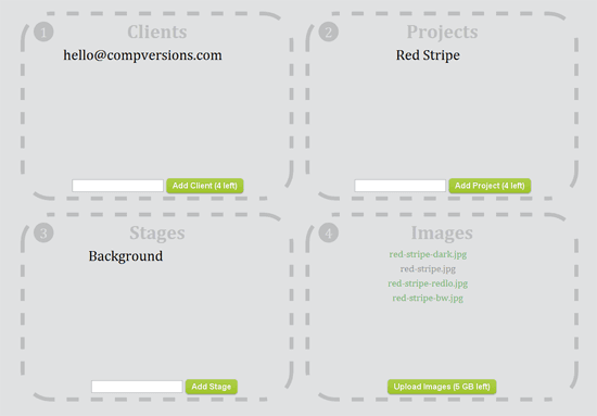
It does matter how your application looks once the data is entered.
CompVersions has done it this way:
CONSIDER GEARHEART YOUR TRUSTED PARTNER
We create complex custom web applications from scratch for both startups and mature businesses. Our focus is on functional solutions, in which we fully take into account the technical side of the process. Our portfolio has a lot of different projects for different areas of business, and we mainly create tools for organizing workflows and working with data in Django and ReactJS.
Among others, you can just learn more about our recent project, which we have successfully released and continue to improve already in the production environment. SmartSuite is a web and mobile no-code platform that serves as a tool for managing everything needed to get work done: spreadsheets, documents, collaboration tools, databases, file management products and automation capabilities — all in one place.
We use a flexible workflow based on Scrum. And here we have described in detail the entire development process. We are always open to the most daring ideas and interesting opportunities, and we are ready to get acquainted and develop cool projects together.
FINAL THOUGHTS
There are a lot of rules and principles to consider in order to create a functional and easy-to-use interfaces of web application. Once you have created the UI, which translates into a satisfying UX, your product is certain to hit a home run. Hence, it is a great investment in a functional web app UI design.
Remember that everything should be easy to consume and mind the UI/UX design principles, even if you hire a highly rated designer.
Subscribe for the news and updates
FAQ
What is a user interface design?
What are the principles of UI design in web application?
What are the benefits of web app UI design?


